Quiet Luxury Color Palettes: A Simple Checklist Guide
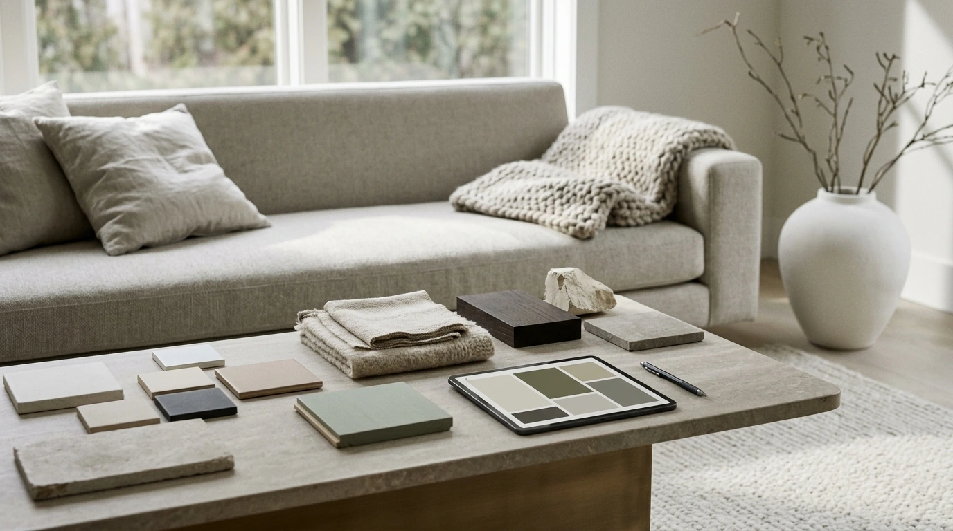
Colorful Quiet Luxury Palettes Checklist: Elegant Color Schemes for Minimalist, Timeless Spaces
Quiet luxury doesn’t have to mean beige-on-beige. With the right balance of muted saturation, refined neutrals, and intentional accents, color can feel understated yet rich. This checklist-style approach keeps outfits, interiors, and brand visuals cohesive—so everything reads elevated, modern, and calmly confident rather than loud or trendy.
What “colorful quiet luxury” looks like
- High-quality restraint: fewer colors, each with a clear job (base, support, accent).
- Softened intensity: dusty, mineral, and chalky tones instead of neon or overly primary color.
- Depth through value: contrast comes from light-to-dark shifts, not hard hue clashes.
- Texture does the heavy lifting: matte finishes, natural fibers, stone, and brushed metals make color feel refined.
If you want a practical, repeatable way to build these combinations, the Colorful Quiet Luxury Palettes Checklist (digital download) is designed to help you choose roles, ratios, and contrast levels quickly—without overthinking every decision.
The palette checklist (fast, repeatable process)
- Choose a neutral base (about 60%): warm ivory, cool bone, greige, soft charcoal, or deep espresso. Pick one anchor family and stay consistent.
- Add a supporting neutral (20–30%): a neighboring neutral that adds dimension (bone + stone, charcoal + slate, espresso + cocoa).
- Select one “quiet color” (10–15%): desaturated sage, muted denim, smoky lilac, terracotta clay, or soft oxblood. Favor calm undertones.
- Add one optional micro-accent (0–5%): antique brass, ink black, porcelain white, or a single crisp note used sparingly.
- Confirm undertones: keep warm-with-warm or cool-with-cool unless you intentionally mix using a bridging neutral (often greige, taupe, or bone).
- Set your contrast range: choose a light, mid, and dark value so the palette works across backgrounds, trim, accessories, and readable text.
Quiet Luxury Palette Roles (quick reference)
| Role | Percent | Purpose | Examples |
|---|---|---|---|
| Neutral base | 50–70% | Creates the “quiet” canvas | Ivory, greige, soft charcoal |
| Supporting neutral | 20–30% | Adds depth without adding noise | Stone, taupe, slate |
| Quiet color | 10–15% | Introduces personality with restraint | Sage, dusty blue, clay |
| Micro-accent (optional) | 0–5% | Finishes the look with precision | Antique brass, ink black |
Six refined color directions (choose one lane)
- Mineral neutrals + sage: stone, bone, eucalyptus, brushed brass.
- Ink + warm cream + dusty rose: soft contrast with a romantic edge.
- Clay + sand + deep brown: grounded, sun-baked warmth that still feels tailored.
- Slate + fog + muted denim: cool, architectural calm with a subtle color lift.
- Oxblood + taupe + porcelain: moody elegance that reads classic, not heavy.
- Smoky lilac + greige + graphite: modern, quiet, slightly artistic without feeling trendy.
For extra accuracy when you’re matching paint, textiles, or print colors across vendors, professional color references can help. Explore the Pantone Color Systems and Guides for standardized color communication, and brush up on fundamentals with the Interaction Design Foundation’s color theory resources.
Where these palettes work best (and how to apply them)
Interiors
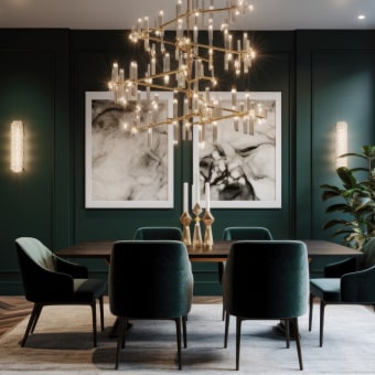
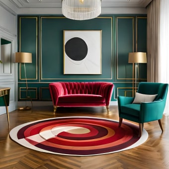
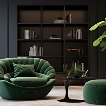
Let the largest surfaces stay calm. Use walls, large rugs, or big upholstery as the neutral base, then place your quiet color into textiles, art, and one statement piece rather than a scatter of small accents. A strong anchor material can do a lot of work—like a substantial stone-and-metal centerpiece such as the Luxury marble round coffee table with gold stainless steel base, which naturally supports quiet palettes with warm metallic micro-accent built in.
Wardrobe
Start with a “neutral backbone” (outerwear, trousers, shoes, everyday tops), then rotate one quiet color through knits, scarves, bags, or a single layer. The goal is repetition, not variety: one muted color repeated across a few pieces reads intentional and expensive.
Brand visuals
Keep backgrounds and typography neutral for clarity and longevity, then reserve your quiet color for a specific role—like calls-to-action, section headers, or key highlights. This protects readability while still giving your visuals a recognizable signature.
Event styling
Repeat the same hue in two places (for example: florals + stationery, or ribbons + menu cards). Repetition creates “designed” energy; random accents create “leftover” energy.
Materials and finishes that make color feel expensive
- Matte or eggshell wins on large surfaces: high-gloss can make muted colors feel louder than intended.
- Pair textures to temperature: warm palettes love linen, oak, and travertine; cool palettes shine with wool, smoother stone, and brushed steel.
- Use metallics as micro-accents: antique brass warms things up, polished nickel cools things down, blackened metal adds modern structure.
- Repeat one texture at least twice: boucle chair + boucle pillow, or linen drapery + linen lampshade, to create quiet cohesion.
Common pitfalls (and quick fixes)
- Too many accent colors: reduce to one quiet color and one micro-accent; convert the rest into neutrals.
- Mismatched undertones: if something looks “off,” swap the supporting neutral first (it’s often the true culprit).
- Flat results: add a darker value (charcoal, espresso, ink) in small amounts to restore structure.
- Over-patterning: keep patterns low-contrast; one larger pattern reads calmer than many small ones.
Digital checklist download: how to use it week-to-week
If you want the process laid out as a ready-to-use worksheet, you can grab the Colorful Quiet Luxury Palettes Checklist (digital download) and build a repeatable palette library that stays consistent across seasons.
FAQ
Can a minimalist style still use color without looking busy?
Yes—limit the palette to two neutrals plus one muted color, keep contrast controlled, and use color in larger, calmer blocks instead of many small accents.
How many colors are ideal for a quiet luxury palette?
Usually 3–4: a neutral base, a supporting neutral, one quiet color, and an optional micro-accent used sparingly.
What’s the easiest way to tell if undertones clash?
Compare colors next to a true neutral (white or gray) and look for warmth (yellow/red) versus coolness (blue/green). If they pull opposite directions without a bridging neutral, swap one component.









Leave a comment