Neutral + Jewel Tone Decor: Easy Room-by-Room Palettes
Harmonizing Hues: Pairing Neutral Foundations with Jewel-Tone Accents
Neutral walls and core furnishings set a calm baseline that adapts as tastes change. Jewel tones—emerald, sapphire, ruby, amethyst, and topaz—bring depth and drama, but they look most polished when they’re “contained” inside a thoughtful neutral framework. Use the ideas below to build reliable pairings, place color room by room, and test combinations with less guesswork before investing in paint, textiles, or statement decor. For more guidance, see Jewel Tone Colors: A Guide to Using Rich Hues – Havenly.
What Makes Neutrals and Jewel Tones Work Together
Neutrals act like a volume control: they set the overall brightness of a room and make saturated color feel intentional rather than loud. Jewel tones read as rich and tailored, especially when there’s enough negative space around them and the room includes varied textures that prevent color from looking flat. For further reading, see Jewel Tones: The Best Ways to Add Bright, Saturated Color to Your ….
A dependable formula is: one dominant neutral, one supporting neutral, one hero jewel tone, and one unifying finish (metal or wood). Undertones matter, too—warm neutrals tend to flatter greens and reds, while cool neutrals pair cleanly with blues and purples. Finally, texture does a lot of heavy lifting: think matte paint, velvet, linen, leather, marble, ribbed glass, and natural fibers to keep the palette layered and livable.
Choose the Neutral Base: Warm, Cool, or Balanced
Warm neutrals
Cream, ivory, greige, camel, and warm taupe create a cozy backdrop, especially in north-facing rooms or spaces that need softness. They pair naturally with emerald, burgundy, and brass.
Cool neutrals
Crisp white, stone gray, cool beige, and charcoal lean modern and sharpen contrast in bright daylight. They look especially crisp beside sapphire, plum, and chrome or matte black accents.
Balanced neutrals
True taupe, soft mushroom, and mid gray work like a bridge when multiple jewel tones appear in one open-plan space. They’re often the easiest option for mixed materials (wood, metal, stone) because they don’t pull overly yellow or icy.
A quick undertone test
Hold a pure white sheet of paper next to the neutral sample. If the sample looks yellow or creamy by comparison, it’s warm; if it looks bluish or slightly purple, it’s cool. Keep large surfaces quiet (walls, big rugs, sofas) and use jewel tones in controlled zones like drapery, accent chairs, art, or pillows.
Palette Pairing Map (Fast Combinations That Look Polished)
Start with one hero jewel tone, then repeat it in two or three smaller elements so it doesn’t feel like a one-off. Add depth by choosing a supporting neutral that’s one step darker than the dominant neutral (ivory plus taupe; light gray plus charcoal). Finishes function as color-correctors: brass warms blues and greens, nickel cools reds and purples, and matte black sharpens almost any palette.
Neutral + Jewel Tone Pairings (with finishes and texture ideas)
| Dominant neutral | Hero jewel tone | Best metal/wood finish | Easy textures to add | Where it works best |
|---|---|---|---|---|
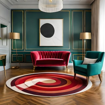
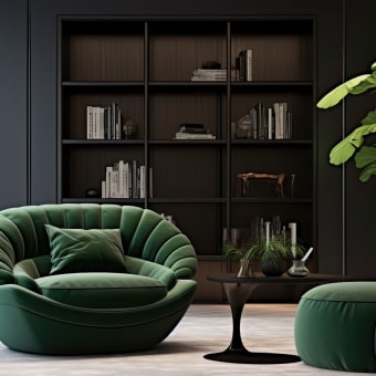
| Ivory / warm white | Emerald green | Brass or walnut | Velvet, boucle, natural linen | Living rooms, reading corners |
| Greige | Sapphire blue | Brushed nickel or oak | Wool rug, matte ceramics, cotton | Open-plan spaces, offices |
| Stone gray | Amethyst / plum | Matte black or smoked oak | Ribbed glass, suede, layered knits | Bedrooms, lounges |
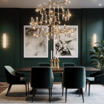
| Warm taupe | Ruby / burgundy | Antique brass or dark wood | Leather, woven baskets, thick drapery | Dining rooms, dens |
| Charcoal | Topaz / golden amber | Brass or blackened steel | Marble, boucle, textured wallpaper | Modern apartments, media rooms |
Room-by-Room Strategy: Where to Place Jewel Tones
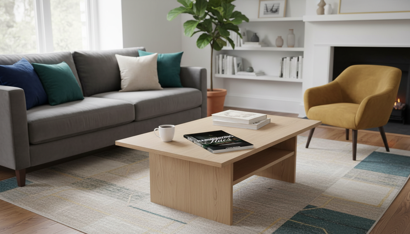
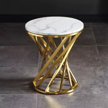
Living room
Anchor the room with a neutral sofa and rug, then choose one jewel-tone statement—drapes, a bold accent chair, or a large artwork. Repeat that color in two smaller accents (pillows, a vase, a throw) for a cohesive rhythm. For a crisp neutral-luxe base that naturally supports saturated color, a piece like the Luxury marble round coffee table with gold stainless steel base adds lightness and structure while brass warms cool jewel tones.
Bedroom
Dining area
Jewel tones shine in upholstered dining chairs, a painted sideboard, or a bold centerpiece. Balance with neutral walls and warm wood so the room still feels welcoming. A grounded anchor like a Rustic wood sideboard can unify mixed finishes and give saturated accents a natural counterweight.
Kitchen
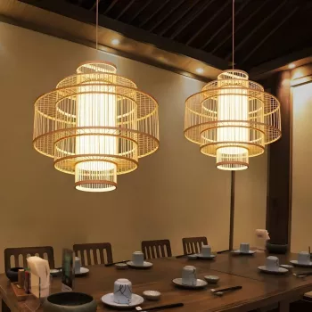
Entryway
Small square footage is perfect for a controlled jewel-tone moment: a bench cushion, a runner, or a mirror frame. Layer in warm texture overhead with lighting such as the Southeast Asian-inspired bamboo and rattan pendant chandelier, which adds built-in neutrality and makes jewel accents feel collected rather than stark.
Color Palette Checklist (Before Buying Anything)
For a printable, step-by-step approach that combines palettes, placement tips, and faster visualization, the Harmonizing Hues digital guide with palette checklist and AI design tips helps keep decisions consistent across rooms.
AI Design Tips to Visualize Your Palette Faster
Pulling the Look Together with Statement Pieces
FAQ
How many jewel tones can be used in one room without it looking busy?
Start with one hero jewel tone and add one secondary jewel tone sparingly. Keep everything else neutral, and unify the look by repeating the same metal and wood finishes across the room.
Do jewel tones work with beige and warm whites?
Yes—warm neutrals pair especially well with emerald, burgundy, and amber because their undertones feel naturally harmonious. Balance the richness with texture (linen, boucle, leather) and warm finishes like brass or medium-to-dark wood.
What is the easiest way to test a neutral and jewel-tone palette before buying furniture?
Create a small sample board: paint chip, two fabric swatches, one metal sample, and one wood sample, then view it in daylight and at night. Use AI mockups as a first pass for direction, but confirm with real materials before making big purchases.


Leave a comment